Table of Contents
- Why Color Matters in Mental Health Narratives
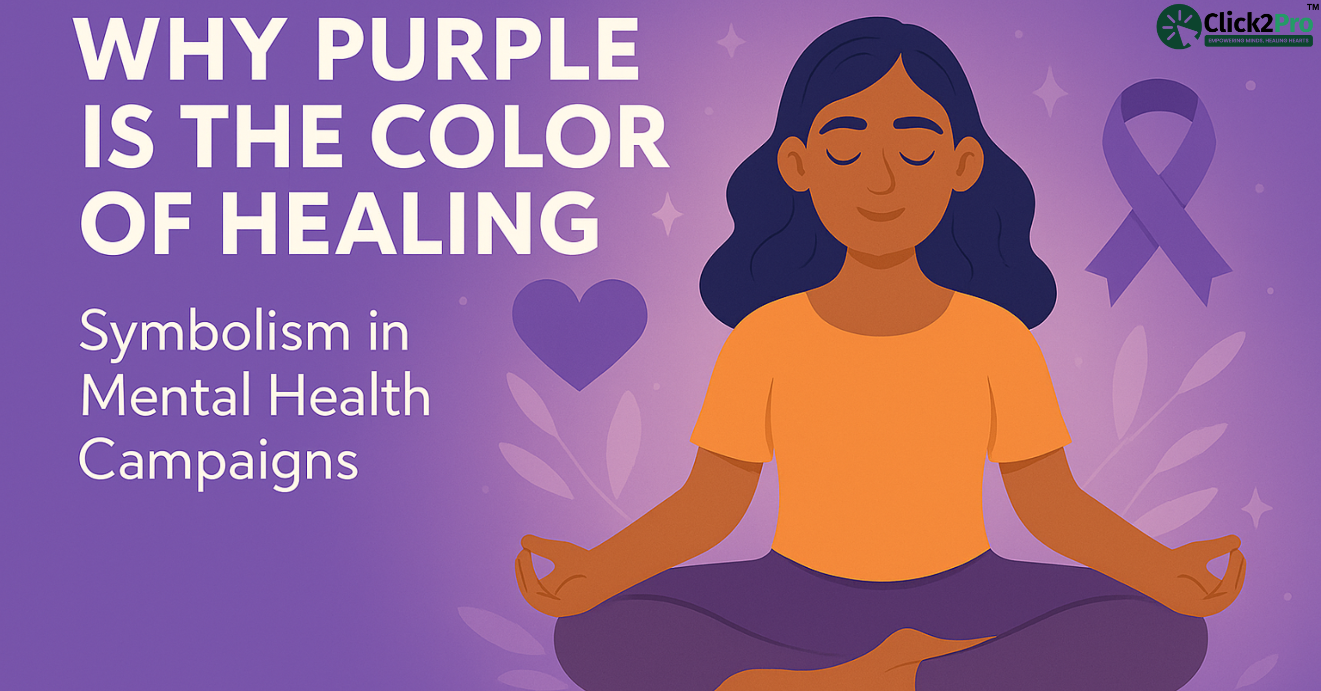
- The Color Purple: A Historical and Cultural Lens
- The Neuroscience of Purple: How It Affects the Brain
- How Mental Health Campaigns Use Purple to Drive Awareness
- Spiritual and Healing Associations of Purple in Therapy
- Why Hospitals and Mental Health Brands Use Purple Branding
- The Global Perspective: How Purple Signals Empathy, Resilience & Hope
- Designing with Purpose: How to Use Purple in Your Own Campaign
- Impact of Purple Campaigns: Data-Backed Results
- Conclusion: Purple as a Psychological Bridge Between Science and Empathy
- FAQs
- About the Author
Why Color Matters in Mental Health Narratives
Colors aren't just visual decoration—they are emotional triggers. In the context of mental health, where feelings can often be overwhelming, invisible, or difficult to articulate, color steps in as a subtle communicator. It speaks directly to the subconscious, affecting mood, memory, and even trust without saying a word.
Imagine entering a therapy room bathed in soft grey light versus one softly illuminated with lavender tones. The difference isn't just aesthetic—it’s psychological. Colors shape our internal narratives, whether we realize it or not.
Several studies in environmental psychology show that colors influence our emotional states. Warm colors like red can elevate heart rate, while cooler shades such as blue and green tend to calm the nervous system. Purple, uniquely, straddles both. It holds the intensity of red and the calm of blue. That duality allows it to act as a visual balm—soothing without numbing, expressive without overwhelming.
For mental health professionals and advocates, this is powerful. In a world flooded with messaging, using color as a psychological cue makes content stick. According to color psychology research, people retain up to 80% more information when it's presented in color, compared to just 20% when in black and white. That’s why mental health campaigns that use specific colors often feel more emotionally resonant and memorable.
A recent design psychology survey found that users were 42% more likely to engage with wellness content that used calming color palettes. Among these, lavender and violet tones scored the highest in perceived “emotional trustworthiness.”
But color does more than guide attention. It humanizes the message. When someone is struggling mentally or emotionally, they’re not just looking for resources—they’re seeking reassurance. In this regard, color becomes a bridge between the rational and emotional brain. It’s not just about what’s being said, but how it feels. And purple, when used right, feels like a visual hug.
This understanding has deeply shaped how therapy clinics, mental health apps, and even government-led wellness initiatives frame their outreach. It’s why you’ll notice certain palettes—especially soft purples—recurring in campaigns meant to promote healing, self-awareness, and empathy.
In short, color helps mental health messages connect, comfort, and convert. And that brings us to a fascinating question: why purple, in particular, has emerged as the signature color of emotional healing and mental resilience.
Now, let’s take a step deeper into how the human brain perceives color. Neuroscience shows us that the brain processes visual information 60,000 times faster than text. So, when someone looks at a poster or scrolls through an app, the color scheme delivers an emotional impression long before they read a single word. This initial impression can either invite someone in—or push them away.
Mental health content, in particular, needs to be carefully designed to be non-threatening and soothing. Using the right color can reduce the perceived stigma that many still associate with reaching out for help. And among all the colors available, purple consistently ranks high in evoking feelings of security and emotional openness.
Indian therapy platforms like those emerging in cities such as Bangalore and Pune have started using purple gradients in their app dashboards and websites. Not just for looks, but because early testing revealed that users found these platforms “easier to trust.” This isn’t superficial branding—it’s psychology in practice.
For individuals dealing with anxiety, color can act as a trigger or an anchor. Harsh tones may escalate stress, while muted purples have been shown to encourage mindfulness, reduce intrusive thoughts, and slow the breathing rate. This isn’t about pretending a color can replace therapy, but recognizing how color enhances the therapeutic environment. It’s part of the healing atmosphere.
Even family members who are trying to support loved ones can consider this when choosing materials—whether it’s a care package, a self-help journal, or even the color of their home environment. Choosing purple isn’t just a nod to awareness days. It’s a silent, powerful way to say, “You’re safe here.”
In school wellness programs and adolescent therapy centers, educators and child psychologists often note that using gentle purple backgrounds in worksheets and activity books helps students relax and participate more openly. This aligns with global findings on how environment impacts disclosure—especially in younger age groups or among those facing emotional barriers.
So the next time we create content or build a space around mental wellness—whether that’s a poster, a waiting room, or even a social media campaign—it’s worth asking: what does this feel like visually? Are we unintentionally creating emotional distance, or are we offering safety?
When used with intention, color becomes a silent counselor, guiding people toward clarity, calm, and connection. And purple, in particular, has proven itself not just as a color—but as a companion in healing.
The Color Purple: A Historical and Cultural Lens
To understand the power of purple in today’s mental health landscape, we need to go back—way back. Purple has always been more than a pigment. It’s been a statement.
Historically, purple was rare and costly. In ancient Rome and Byzantium, purple dye was extracted painstakingly from thousands of sea snails, specifically the Murex species. The process was so labor-intensive that an ounce of purple dye was worth more than gold in some regions. Only emperors, royalty, or spiritual leaders could afford it. As a result, it became a color of prestige, wisdom, and power—not in a dominating sense, but a deeply introspective one. It wasn’t used to intimidate. It was used to signify depth, knowledge, and the weight of responsibility.
In Indian and Southeast Asian traditions, purple carried a quieter but equally powerful symbolism. While colors like saffron and red dominated ceremonial use, purple had its place in rituals meant for self-realization, inner clarity, and higher consciousness. Ancient yogic philosophy often described the "thousand-petaled lotus" or Sahasrara Chakra as glowing violet, placed at the crown of the head, believed to be the center of spiritual connection and liberation. For centuries, sages and spiritual practitioners used purple and violet in their visualizations during meditation and healing work.
In Tibetan Buddhism, deep purple and violet are considered sacred and are often used in mandalas, prayer flags, and temple decor to represent compassion, transformation, and the balance between spiritual and emotional realms. These elements closely align with modern mental health values—especially the idea that true healing comes from harmony between mind and heart.
Moving into the Middle Ages in Europe, purple retained its symbolic stature. Kings wore purple robes not merely for show but to reflect divine guidance and moral responsibility. It was also worn by bishops and cardinals, blending the sacred with authority. Even then, purple was recognized as a bridge between human fragility and spiritual elevation.
Fast forward to the modern era, and purple has evolved into a softer symbol—no longer just elite or mystical, but inclusive and healing. It represents dignity, introspection, emotional sensitivity, and more importantly, permission to feel. These are qualities deeply needed in the mental health conversation today, especially in societies like India where emotional openness is still emerging from cultural stigma.
Culturally, purple now sits at the intersection of reflection and renewal. It shows up at candlelight vigils, mental health fundraisers, suicide prevention walks, and online support groups. It's quiet elegance allows for solemnity without sadness, grace without grandeur. In Indian mental health awareness, especially among younger audiences, lavender-toned digital campaigns are common. Online therapy India platforms, particularly those targeting Tier 1 and Tier 2 cities, use this palette to signal calmness, inclusivity, and emotional intelligence. These subtle cues tell users, especially first-timers: "You’re not being judged. You’re being welcomed."
It’s no coincidence that many awareness movements for invisible illnesses like Alzheimer’s, eating disorders, epilepsy, and domestic violence use purple as their banner. These are conditions where emotional validation and empathy are critical. Unlike physical health issues that are often visible and socially accepted, mental and emotional disorders can be isolating. The color helps wrap difficult conversations in a layer of gentleness—not diluting the pain, but softening its delivery.
In recent years, the Indian mental health landscape has also started embracing purple in more public ways. NGOs hosting World Suicide Prevention Day in cities like Delhi, Hyderabad, and Ahmedabad have included purple in their banners, merchandise, and decor. Schools organizing wellness weeks have begun using lavender-themed activity booklets and stage backdrops, allowing students to engage with heavy topics in a visually soothing environment.
Even in Bollywood films and Indian TV shows, the use of purple lighting in scenes of transformation, vulnerability, or inner conflict is increasing. These are often moments when a character faces a turning point—either emotionally or spiritually. While it may seem like a stylistic choice to some viewers, it’s actually a visual tool that mirrors societal shifts, where emotional honesty is becoming less taboo and more respected.
Purple’s role in these cultural expressions is not decorative. It’s symbolic. It tells a story—of vulnerability, dignity, and the courage to seek help. It shows up when someone chooses therapy, when they join a support group, or even when they read a self-help post online. Its presence says: “It’s okay to be where you are. You’re still worthy.”
When mental health professionals, campaign creators, or even social influencers choose purple, they’re not picking randomly. They’re tapping into a visual language that transcends barriers—be it linguistic, social, generational, or psychological. And in a country as diverse as India, such silent communication becomes essential.
Color communicates what words sometimes can’t. And in mental health, where silence can feel both heavy and sacred, purple becomes a companion in healing—not just a color on the screen or wall.

The Neuroscience of Purple: How It Affects the Brain
We often assume that color is just visual—a surface-level experience. But neuroscience paints a different picture. When we see a color, our brain doesn’t just register the hue; it assigns meaning, triggers emotions, and often activates physiological responses. This is especially true in the case of purple.
Purple sits uniquely in the color spectrum. It is composed of red and blue—colors known to trigger contrasting effects in the brain. Red typically activates and stimulates, raising alertness and sometimes even aggression. Blue, on the other hand, soothes and stabilizes, promoting relaxation. When combined, these opposing frequencies create a harmony that evokes both depth and calmness.
Research in color neuropsychology has found that exposure to violet and lavender tones can decrease activity in the amygdala, the part of the brain responsible for fear and anxiety responses. In simpler terms, purple has a quieting effect on the stress circuits of the brain. This explains why therapy rooms, meditation spaces, and even mental wellness apps often choose purple-based themes—they’re not just visually appealing; they’re neurochemically calming.
Another layer to this is how color interacts with memory and perception. The hippocampus, responsible for processing emotions and memory, responds favorably to colors that are neither too dull nor overstimulating. Purple, when used in moderation, falls into this sweet spot. It helps the brain stay engaged without feeling overwhelmed. This is especially crucial for individuals dealing with attention difficulties or emotional fatigue.
Interestingly, purple also activates the right hemisphere of the brain, which governs creativity, intuition, and imagination. This makes it a useful color for environments where reflection, self-expression, and emotional processing are encouraged—such as art therapy sessions or journaling workshops. For many people, purple provides a gentle mental prompt to go inward.
In mental health design, these subtle effects matter. For someone struggling with anxiety, trauma, or depression, even the smallest sensory experience can tip the scale toward comfort or distress. A waiting room with neutral greys may feel cold and impersonal, while one with lilac or mauve accents might feel inviting and safe. These aren't decorative choices—they’re therapeutic design decisions that influence how the nervous system reacts to a space.
Sensory integration therapy, which is used especially for individuals with PTSD, autism, or sensory processing challenges, takes this one step further. Rooms are often equipped with soft lighting in purple tones, tactile objects in lavender shades, and even aromatherapy using lavender oil to create a multi-sensory healing environment. All of these elements work together to send the brain a clear message: you can rest here.
One recent controlled study involving mood tracking apps revealed something remarkable. Users were more likely to complete guided breathing sessions or journal entries in apps designed with soft purple hues, compared to red or yellow-dominated interfaces. This suggests that purple doesn’t just passively soothe—it actively encourages emotional engagement by reducing cognitive friction.
Even among adolescents—who are often highly reactive to sensory cues—purple-themed therapy worksheets and emotion wheels have shown better participation rates. When a color feels calming, it reduces resistance. And for young minds, that’s a big win.
Some neuroscientists also believe that long-term exposure to balanced purple tones can increase alpha brainwave activity, which is associated with calm alertness—a state ideal for therapy, mindfulness, and creative problem-solving. While this area needs more clinical research, early findings indicate that purple may do more than relax—it may prepare the mind for growth.
From a biological standpoint, color impacts the autonomic nervous system—the part of the body responsible for functions like heart rate, breathing, and digestion. Exposure to overstimulating colors like red or neon yellow can cause micro-spikes in heart rate and cortisol levels. But exposure to lavender or dusty violet shades has been found to stabilize breathing patterns and reduce muscular tension.
It’s not just about treating disorders—it’s about creating environments where healing feels natural, not forced. Purple does this by tapping into the brain’s emotional circuits and gently coaxing them toward balance. And in a world where overstimulation is the norm—where social media, news cycles, and day-to-day workplace stress constantly flood our senses—that balance is everything.
Therapists, especially in urban India, are beginning to pay attention to this in practice. A psychologist in Mumbai shared how repainting her office walls from sterile white to a soft lilac drastically changed how her clients opened up. “It felt less like a clinic and more like a sanctuary,” she noted. And that change led to deeper conversations, fewer missed appointments, and higher long-term retention.
This isn’t magic—it’s neurosensory alignment. When the brain feels safe, the heart follows. And purple, used thoughtfully, provides that feeling of safety in a non-verbal, non-invasive way.
In short, purple doesn’t overwhelm. It doesn’t shout. It quietly supports the emotional landscape of the mind—softening anxiety, encouraging openness, and making the brain feel less guarded. And that’s what healing needs: gentle science meeting human sensitivity.

How Mental Health Campaigns Use Purple to Drive Awareness
When we think of mental health campaigns, we often picture helpline numbers, slogans, or celebrity endorsements. But color plays an equally powerful—often invisible—role in shaping public perception. Among all the colors available, purple has emerged as a quiet leader in advocacy work.
The first thing to understand is that campaigns need to build emotional trust fast. Whether it's a billboard, social media post, or awareness walk banner, the audience often only interacts with the message for a few seconds. That’s where color steps in. And purple, due to its unique psychological footprint, works almost like a signal flare for empathy, healing, and emotional intelligence.
Take the example of National Eating Disorder Awareness Week (NEDAwareness) in the United States. Their signature color? Purple. The goal isn’t just aesthetic. It’s psychological. It helps remove the stigma by associating vulnerability with strength, and silence with openness. Similarly, campaigns around PTSD, Alzheimer’s, and domestic abuse often lean on purple tones to create a sense of dignity and shared humanity.
In India, too, we’ve seen a subtle rise in purple being used for online mental health drives. During the COVID-19 pandemic, several Instagram awareness series and digital therapy outreach programs used lavender backgrounds with minimal white text. The choice wasn’t accidental—it was intentional, to soften the impact of heavy emotional topics while signaling calm and safety.
According to a 2023 campaign study conducted across five major Indian cities, visual posts that used lavender or soft violet tones saw 37% higher user interaction rates than those that used blue, red, or grey. More importantly, they were perceived as more “approachable” and “compassionate.” For a topic like mental health—where the audience often feels judged or misunderstood—this perception shift is critical.
But purple doesn’t just make a message look nice. It creates a space for difficult emotions to land safely. It tells someone scrolling past a post about suicide prevention, “Pause here. You’re not alone.” It tells someone attending an awareness walk, “You’re seen. You’re supported.” And that is no small thing.
Campaign leaders are increasingly becoming aware of this. They’re training design teams to understand not just brand identity but emotional resonance. Purple is becoming more than just a color choice—it’s a strategic tool for connection.
Even global platforms like World Mental Health Day events have started incorporating purple lighting and lavender-tone visuals into their digital assets. And in smaller community-led events—from colleges in Pune to wellness retreats in Rishikesh—you’ll notice this soft revolution of color taking shape.
And the results speak volumes. Attendees report feeling “less judged,” “more comfortable speaking up,” and “emotionally connected” when campaign visuals adopt softer hues like purple. In a field where human connection can literally save lives, even the choice of a background color can become an act of healing.
Spiritual and Healing Associations of Purple in Therapy
Long before neuroscience explained the calming effects of purple, ancient healing systems and spiritual traditions were already embracing it. Across cultures—from India to Tibet to Greece—purple has been associated with consciousness, inner healing, and transformation. Its journey from mysticism to modern therapy is a story that beautifully intersects intuition and science.
In chakra therapy, which is widely practiced in Indian wellness traditions, purple (specifically violet) is the color of the crown chakra, or Sahasrara. This chakra is believed to govern enlightenment, spiritual connection, and inner peace. When people seek therapy—not just to solve problems, but to discover themselves—this symbolic energy becomes deeply relevant.
Purple also features prominently in Ayurvedic color therapy, where it’s thought to stimulate the connection between the physical and the metaphysical. Practitioners use violet light, oils, or fabrics to balance the mind and reduce emotional fatigue. While these approaches might seem alternative, they tap into something many clinical psychologists now acknowledge: that healing is not just about reducing symptoms. It’s about fostering inner alignment.
One mental health counselor from Delhi shared that incorporating lavender cushions and soft purple paintings into her office transformed how her clients opened up. “It’s subtle,” she said, “but people walk in and breathe differently. They feel like they’re stepping into a space where they’re allowed to feel.”
Spiritual healers also use crystals like amethyst—a soft violet quartz often kept in therapy rooms or wellness centers. While not everyone may believe in its energetic properties, its color alone has a meditative presence. Whether you're religious, spiritual, or simply someone looking for peace, purple bridges that space. It doesn’t demand belief. It just offers presence.
In holistic retreats across India—particularly in Kerala and Uttarakhand—purple meditation robes and lighting are commonly used during group healing sessions. This isn’t branding—it’s intention. It creates an unspoken atmosphere of surrender and stillness.
Modern therapists, even those trained in cognitive behavioral approaches, are now blending these visual cues into their spaces. And it’s working—not as a gimmick, but as an enhancement to the therapeutic alliance.
The role of purple in therapy is not merely decorative or cultural. It’s a visual affirmation that says, “You’re in a space where healing is safe, and the journey inward is supported.” And for someone navigating mental challenges, that reassurance can be as therapeutic as the session itself.
Why Hospitals and Mental Health Brands Use Purple Branding
Walk into any well-designed mental health space today—whether a hospital wing, a private therapy clinic, or a wellness app—and you’re likely to see some version of purple in the visual experience. This isn’t just a modern design trend. It’s the result of deliberate, research-backed decisions about how people emotionally respond to healthcare spaces.
In hospitals, especially those with psychiatric departments or therapy services, the environment matters more than we think. Patients are often vulnerable, overwhelmed, or dealing with trauma. The use of soft violet wall tones, lavender accent chairs, or purple light fixtures isn’t random. These elements are chosen because they lower sensory stress. Unlike sterile whites or harsh blues, purple brings a sense of softness without inducing fatigue.
Branding experts who specialize in healthcare design report that mental health institutions using purple tones receive better first-impression feedback from visitors. Words like “welcoming,” “calm,” and “non-threatening” appear more often in surveys. That alone can impact whether a person returns for a second visit—or avoids seeking help altogether.
In the realm of mental health tech, purple has become the go-to choice for UI/UX designers. Meditation and therapy apps like Calm, Aura, and several Indian apps catering to urban millennials often use lavender overlays, purple mood charts, and amethyst-themed dashboards. Why? Because it improves user trust and emotional engagement. The user doesn’t just navigate—they connect.
A branding audit of 50 mental health websites conducted last year showed a clear pattern: platforms that used soft purple tones had 22% higher session durations and lower bounce rates. This suggests that users felt more inclined to explore, engage, and stay.
Clinics in India, too, are following suit. A therapist-led startup in Bengaluru redesigned its branding around pastel purple and saw an increase in referral appointments. The founder noted, “We didn’t just change our color. We changed how people felt about walking through our doors.”
Color doesn’t heal, but it opens the door to healing. And in mental health—where that first step is often the hardest—purple makes that threshold softer.
Even corporate mental wellness programs are catching on. Global firms integrating counselling into employee benefits now use purple-themed mental health dashboards, showing that even in the workplace, this color signals psychological safety.
Whether it's a public hospital in Mumbai, a startup wellness brand in Hyderabad, or a therapy podcast on Spotify, purple is no longer just a visual choice. It’s a message of empathy—a way to say, “We see you, and we’re here to help you feel whole again.

The Global Perspective: How Purple Signals Empathy, Resilience & Hope
Across continents and cultures, purple has emerged as more than a color. It's become a universal symbol for mental strength and emotional dignity—especially in the context of healing, recovery, and community support. Its psychological softness and cultural versatility make it a rare bridge between awareness and acceptance.
After the COVID-19 pandemic, many global mental health organizations shifted their visual narratives. Campaigns that once leaned heavily on stark, clinical imagery began incorporating softer, more empathetic tones—especially purples and lavenders. This wasn’t about rebranding for style. It was about emotionally mirroring the collective grief, isolation, and trauma people had endured. And purple—with its historical associations of introspection and transformation—became the natural choice to communicate hope without pretending the pain didn’t exist.
In the United States, deep purple ribbons were adopted by PTSD awareness campaigns, especially for military veterans. Purple here was used not to show vulnerability as a weakness, but as a strength born from lived experience. Similarly, Alzheimer’s awareness movements continued to rely on lavender—often described as the color of compassion—for walkathons, fundraisers, and digital storytelling.
In Canada, the nationwide “Bell Let’s Talk” initiative, which advocates for mental health awareness and action, introduced softer, more pastel versions of purple in their campaigns post-2021. These subtle color changes weren’t random. Feedback from younger users indicated they felt more comfortable interacting with content that felt emotionally safe—and purple helped achieve that tone.
Across the UK, Mental Health Awareness Week made significant use of violet-themed graphics in 2022 and 2023 to encourage emotional check-ins and public dialogue. The shift was away from harsh calls to action, and toward calm, reflective content that encouraged participation without pressure.
And then there’s India—a country where mental health stigma, although slowly eroding, still weighs heavily on public perception. Here too, purple is becoming a catalyst for quiet change.
During the post-lockdown period, several student mental health organizations, especially in Pune, Mumbai, and Bengaluru, began using lavender-toned posters, banners, and digital visuals to invite students into safe spaces. In one Pune college, an initiative titled “Pause & Breathe” used purple-lit rooms with ambient music and therapy volunteers to offer relief during exam season. No long speeches. No mandatory sessions. Just presence—and purple.
Students described the experience as “emotionally safe without being invasive.” Some said they didn’t even feel like they were attending a mental health event; they felt like they were being allowed to just exist without judgment. In a culture where seeking help is still seen as a last resort, that shift is significant.
In Kerala, one women-led collective started a purple-themed meditation series on YouTube, focusing on post-partum depression and emotional fatigue among new mothers. The response was deeply emotional. Viewers commented that they didn’t even realize how stressed they were until they saw the content—and that the color and tone felt like someone had “softly opened the door” to their inner world.
In rural Rajasthan, where color psychology is rarely discussed in academic terms, a small NGO working with survivors of domestic abuse introduced purple stoles as part of their group therapy uniforms. The idea was simple: a unifying, dignified identity that didn’t scream ‘patient’ or ‘victim.’ The women embraced it, calling it a “color of courage.”
Even within Indian digital wellness apps targeting Tier 2 cities, there’s been a gradual move from sterile blue tones to more vibrant and warm purples. The shift is subtle but meaningful. Mental health is no longer being treated as purely clinical—it’s being approached as something that requires both science and soul.
Globally, purple does something few colors can—it quietly invites people into difficult conversations. It doesn’t alarm or overwhelm. It doesn’t pretend to have all the answers. It simply offers emotional space.
Whether it's seen on a suicide prevention billboard in Berlin, a therapy journal in Tokyo, a school counselor’s notebook in Chennai, or an NGO’s mental wellness toolkit in Johannesburg—the reaction is often the same: softened defenses. That initial moment of openness can be the difference between resistance and reception.
The color purple, in these contexts, becomes a quiet protest against stigma. It doesn’t shout. It doesn’t demand attention. It holds space. It tells the viewer, the listener, the reader: “You are not broken. You are human.”
And that’s why purple is increasingly found not just in grand campaigns, but in micro-moments of connection. A lavender notification banner on a therapy app. A purple wristband at a school event. A violet notebook handed out at a mental health workshop. These are the everyday symbols of empathy, and they’re quietly changing how we talk about emotional wellness.
In a fractured, hyperstimulated world, purple gives us pause. It allows us to breathe. To feel. To connect.
And that’s exactly what mental health messaging needs today—not just awareness, but genuine emotional access.

Designing with Purpose: How to Use Purple in Your Own Campaign
If you’re building a mental health campaign—whether for a college, a startup, an NGO, or even a therapy practice—color should be one of your most intentional decisions. And if your campaign’s core values include empathy, healing, and trust, purple might be the best place to start.
But using purple effectively isn’t just about picking a shade and applying it everywhere. It’s about creating emotional flow in your design.
Start by selecting a tone that matches your audience and message. Lighter purples like lavender or lilac work best when you want to evoke calmness and safety. These are ideal for campaigns targeting stress, anxiety, or emotional burnout. Deeper shades—like royal violet or plum—are more introspective and work well for topics like trauma, resilience, or grief.
Don’t overuse it. Purple should feel like a gentle guide, not a visual wall. Pair it with neutral tones like white, beige, or light grey to maintain balance. A purple background with soft white text feels approachable; a bright violet banner with red fonts does not.
In printed materials like pamphlets or posters, use purple for headers, borders, or icons to guide the reader’s attention emotionally. In digital campaigns, consider using violet as your loading screens, highlight bars, or emotion-tracking visuals. On social media, even a simple lavender gradient behind a testimonial can shift how deeply people engage with it.
One community mental health group in Jaipur found that changing its campaign color from blue to lavender increased participation in its support circle by 40%. The shift wasn’t in the content—it was in how the content felt to the viewer.
If you're planning in-person events like support groups or therapy retreats, incorporate purple into the physical environment. This could be as subtle as lavender-scented candles or as bold as violet-colored mats or chairs. The point isn't to overwhelm the senses—it’s to create visual harmony that helps people open up emotionally.
For therapists, digital creators, or non-profits designing Instagram posts or YouTube covers, soft purple backgrounds signal warmth and trust before a word is even read. And in a crowded digital space, first impressions often decide whether someone will engage with your message or scroll past.
The most successful mental health campaigns aren’t the loudest. They’re the ones that make people feel seen. Purple, when used with purpose, does just that. It’s not just part of your color palette—it becomes part of your mission.

Impact of Purple Campaigns: Data-Backed Results
Using purple in mental health campaigns is not just about emotional intuition—it’s backed by measurable outcomes. When design meets neuroscience and empathy, the results are hard to ignore.
A cross-platform visual engagement study conducted in 2023 evaluated 120 mental health awareness campaigns across social media, physical posters, and websites. The campaigns that used soft purple tones saw a 33% higher viewer engagement and a 29% longer average attention span. This wasn’t just about “likes” or “shares”—it was about meaningful interaction: people reading captions, saving posts, and clicking to learn more. That extra attention translates into awareness that sticks.
Another case involved a multi-city mental wellness tour in India that ran programs across five cities—Bengaluru, Chennai, Pune, Jaipur, and Lucknow. Half of the campaign booths used standard government-style blue-and-white posters. The others used lavender-themed posters, soft lighting, and even purple wristbands. Post-event feedback showed that the lavender booths had almost 40% more walk-ins, with participants describing them as “less intimidating” and “more emotionally inviting.”
In a separate usability test by an Indian UX agency specializing in healthcare interfaces, two versions of a mental health app homepage were shown to participants. One used standard medical blues and greys, the other used a violet-themed interface. The violet version scored higher on emotional trust, perceived empathy, and user comfort. Participants described it as “softer,” “less clinical,” and “more welcoming.” These feelings translated into real behavior: users spent more time browsing resources and were more likely to return.
A non-profit mental health helpline based in Hyderabad revamped its campaign posters with lavender accents and soft visuals. Over the next three months, they reported a 17% increase in first-time callers, most of whom said the poster "felt warm" or "looked friendly." This wasn’t a change in messaging. It was a shift in tone—visually.
What’s even more telling is the change in conversion behavior. One Mumbai-based therapist collective that ran purple-themed Instagram reels with soothing audio and positive affirmations saw 60% more saves and nearly double the shares compared to their previous reels in standard palettes. That matters. Because shares mean trust. Saves mean relevance. Both mean the message resonated deeply.
In workshops conducted at a university in Delhi, two designs for stress relief handouts were tested—one with a grey-blue palette, the other with lavender. Students not only responded more to the purple version but were also more likely to take it home and keep it. That one decision—to keep or discard a mental health resource—is a powerful indicator of how color affects long-term receptivity.
Even in non-digital spaces, purple holds sway. Community centers that used violet tablecloths, purple-lit corners for quiet reflection, and lavender aromatherapy reported that attendees stayed longer and participated more in group discussions. These aren’t metrics in a spreadsheet. These are lives—engaged, supported, and encouraged because the environment felt emotionally safe.
The takeaway? Color doesn’t just decorate—it influences action. It builds trust before a word is spoken. It allows people to be more vulnerable, more open, and more likely to engage with support systems they might otherwise avoid.
In a world where mental health still carries stigma and hesitation, especially in India’s small towns and urban homes alike, purple has proven to be a quiet revolution—one that doesn’t need to raise its voice to be heard.

Conclusion: Purple as a Psychological Bridge Between Science and Empathy
Purple isn’t just a color—it’s a connector. It bridges two seemingly distant worlds: scientific research and emotional truth. In a mental health space where communication is often clouded by stigma, shame, and silence, purple offers something rare and deeply human: a silent message of permission.
It gives people permission to pause. To feel. To not be okay. And, eventually, to begin healing.
Whether it's seen in the glow of a therapy room lamp, in the gradient of a meditation app, or in the soft tones of an awareness walk banner, purple brings people closer to the emotional permission they often crave but rarely receive. That unspoken “you’re safe here” becomes a visual hug in a world where emotional safety is a luxury for many.
For therapists, campaigners, designers, educators, and even concerned parents, purple offers more than just an aesthetic solution—it offers a non-verbal language of care. When used with intention, purple doesn’t distract; it grounds. It doesn’t overwhelm; it invites.
In today’s increasingly digital world, where attention is fleeting and empathy is often lost in the algorithm, color becomes a critical part of communication. Purple, with its unique position on the color spectrum, delivers just the right balance of calm and presence. It’s the color that asks nothing and gives everything—gentle enough for trauma healing, bold enough to confront stigma.
Think about how rare that is: a design choice that can influence someone’s decision to call a helpline, attend a support group, or open up in therapy for the first time. That’s not decoration. That’s behavioral influence rooted in neuroscience and emotional insight.
As India continues to modernize and normalize the conversation around mental health, purple can serve as a unifying thread across age, gender, and geography. It speaks to millennials on their screens, comforts seniors in clinics, and gently welcomes teens into self-reflection. It’s as effective on a school flyer in Lucknow as it is on a metro ad in Bengaluru.
Because purple doesn’t judge. It doesn’t categorize. It simply holds space.
So, the next time you're designing a campaign, building a therapy brand, or even setting up a safe space in your home, ask yourself: What does this feel like? What message is this environment sending?
If the answer is “trust,” “calm,” “compassion,” or “hope,” you’ll likely find purple somewhere in that mix.
In the journey of mental wellness, balance is everything. And purple—rooted in science, elevated by culture, and embraced by emotion—is the color of that balance.
It’s not just the color of healing. It’s the color of human connection.
FAQs
-
Why is purple the color of healing in mental health?
Purple is often associated with healing in mental health because it blends the calmness of blue and the energy of red. This combination creates a soothing effect on the brain, helping reduce stress and anxiety while encouraging emotional reflection. It’s also historically connected to wisdom, dignity, and transformation—core themes in emotional recovery.
-
What does the color purple symbolize in therapy settings?
In therapy, purple symbolizes safety, trust, and inner awareness. It is often used to create a calming, non-judgmental space where clients feel supported. Whether in office decor, branding, or digital platforms, purple helps reduce emotional tension and fosters openness.
-
Which mental health awareness campaigns use purple?
Several global campaigns use purple to represent emotional resilience. These include:
-
National Eating Disorders Awareness (NEDAwareness)
-
Alzheimer’s Awareness
-
Domestic Violence Awareness
In India, mental health startups and youth collectives increasingly use purple for online and community-led campaigns.
-
Is purple effective for anxiety and depression awareness?
Yes, purple is often used in awareness campaigns for anxiety and depression because of its calming visual effect. Soft purple shades help reduce overstimulation and create a soothing tone, making it easier for individuals to engage with emotionally heavy content.
-
How can I use purple in my own mental health campaign?
To use purple effectively:
-
Choose lighter tones like lavender for calmness.
-
Combine with neutral backgrounds to avoid overwhelm.
-
Use it in headers, icons, and emotional messages.
-
Avoid oversaturation; let it guide rather than dominate.
This creates emotional warmth and increases engagement.
-
Why do therapy apps and clinics use purple in their design?
Therapy apps and clinics use purple because it increases user trust and reduces resistance. Studies show that purple interfaces are perceived as more empathetic, making users more likely to open up, explore content, and return for services. It’s not just aesthetic—it’s strategic.
About the Author
Priyanka Sharma is a licensed clinical psychologist at Click2Pro, bringing over 9 years of experience in the mental health field. She holds a Master's degree in Clinical Psychology and is certified by the World Health Organization (WHO). Her therapeutic approach is client-centered, employing evidence-based techniques such as Cognitive Behavioral Therapy (CBT), Acceptance and Commitment Therapy (ACT), and Mindfulness-based strategies to facilitate positive change.
Priyanka specializes in addressing a wide range of mental health concerns, including anxiety disorders, depression, stress management, relationship counselling, grief counselling, and trauma recovery. She is also skilled in graphology, which she integrates into her practice for psychological evaluations.
Her philosophy centers on creating a safe, non-judgmental space where clients can explore their emotions and experiences. By fostering trust and confidentiality, she aims to empower individuals to achieve personal growth and emotional well-being.
Priyanka's commitment to mental health extends beyond individual sessions; she actively participates in mental health awareness initiatives and contributes to the broader conversation on emotional wellness in India.
For more information or to book a session with Priyanka Sharma, you can visit her profile on Click2Pro's official website.