Table of Contents
- Setting the Stage: Why Colors Shape Our Minds
- The Psychology of the Color Purple
- Purple and Anxiety: Why Some Feel Overstimulated
- Purple and Calm: Why Others Feel Relaxed
- Cultural Symbolism of Purple Across Countries
- Color Therapy & Mental Health: Purple’s Role
- Professions & Situational Impact
- Stats & Data Insights
- Practical Tips: Using Purple for Mental Wellness
- Conclusion: Why Purple Can Be Both Anxiety-Inducing & Calming
- FAQs
- About the Author
Setting the Stage: Why Colors Shape Our Minds
Imagine walking into two different rooms. One is painted in a soft lavender shade, with gentle lighting and the faint smell of essential oils. Most people would describe that space as calming, even healing. Now picture another room filled with deep violet walls, heavy drapes, and dim lighting. For some, it might feel luxurious and creative, but for others, it could feel heavy, overwhelming, or even trigger unease.
This is not random. Human brains are wired to respond to color in powerful ways. Decades of psychological research show that colors can alter heart rate, influence stress levels, and even impact memory. In the United States, design experts often say that color choices in hospitals or schools can affect recovery rates and student performance. In India, color plays a vital role in rituals, spirituality, and emotional well-being, while in the UK and Australia, color therapy has become part of wellness spaces, yoga centers, and even modern workplaces.
The reason colors have such impact is that they are processed in both the visual cortex (responsible for perception) and the limbic system (responsible for emotion). That means a simple shade on a wall, an outfit, or a light filter can create a strong emotional response before words even form in the mind. Some psychologists describe color as a “silent language” of the brain.
For people dealing with stress or anxiety, this silent language can amplify or soothe emotions. A calming color might reduce heart rate and support relaxation. A more intense shade, however, may feel overstimulating. This is where purple becomes particularly fascinating: it is a mix of red’s intensity and blue’s calm, which makes it one of the most psychologically complex colors in the spectrum.

The Psychology of the Color Purple
Purple has always carried dual meanings. In history, it was the color of royalty, power, and spirituality. In modern psychology, it is considered a color of imagination, creativity, and even mystery. But beneath these associations lies a psychological tension: for some, purple calms the mind, while for others, it creates unease.
Scientifically, purple is seen as a hybrid color. It combines the warm stimulation of red and the cool serenity of blue. This duality is why reactions to purple can swing so widely. People sensitive to overstimulation may find deeper purples triggering. The vibrancy can cause the brain to work harder to process the intensity, leading to restlessness or heightened anxiety. On the other hand, lighter shades like lilac and lavender often bring relaxation. These tones are softer on the eye, reminding many of flowers, evening skies, or spiritual practices, which naturally encourage calmness.
In the U.S., surveys suggest purple is often described as “creative” and “spiritual.” Artists and designers lean toward purple when they want to spark imagination. In India, purple aligns with the crown chakra, symbolizing wisdom and higher consciousness, which many interpret as calming. In the UK, purple historically carried associations with mourning, which still influences how some perceive it today. Australians, however, often link purple with creativity and self-expression, with many wellness retreats using lavender and lilac in meditation spaces.
Psychologists also note the role of personal experience. Someone who associates purple with a comforting memory—such as lavender fields in France or childhood blankets—may feel soothed by it. Another who connects it with loss or overstimulating environments may feel anxious instead. In therapy, these personal associations are often explored to understand why a client reacts strongly to certain colors.
In short, the psychology of purple is not fixed. It is layered with culture, personal history, and neurobiology. That’s why some people breathe easier in lavender spaces, while others feel restless in violet rooms.
Purple and Anxiety: Why Some Feel Overstimulated
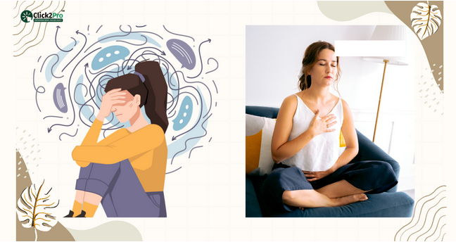
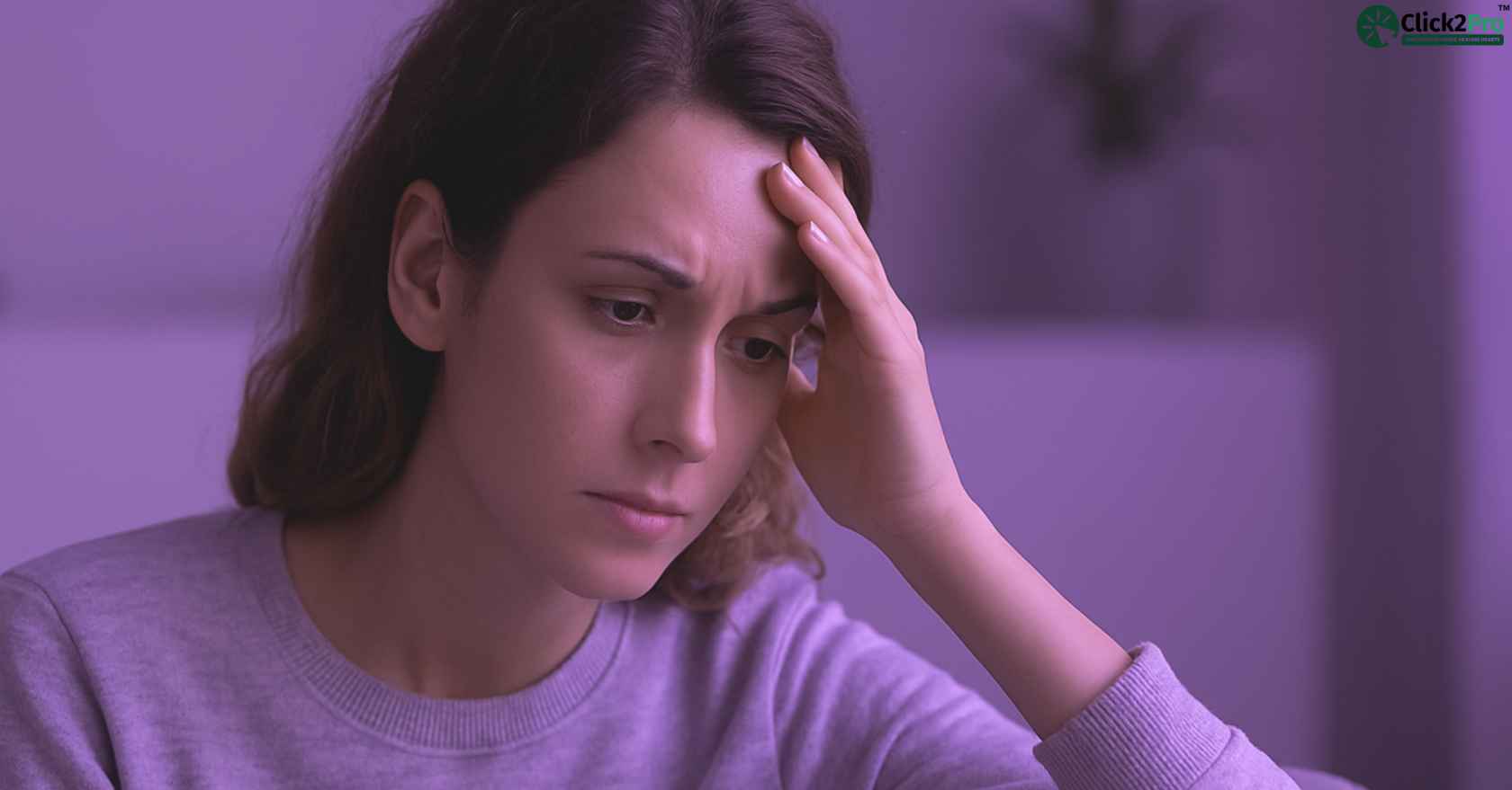
While many people find purple inspiring or soothing, others feel uneasy when surrounded by it. This difference often comes down to the shade, intensity, and personal sensitivity of the viewer.
Deep shades of purple—like violet or plum—can feel heavy. They hold strong amounts of red, which is a stimulating color. For people already prone to stress, this added intensity may cause tension rather than calm. Psychologists describe this as color overstimulation. Just like bright red walls can raise heart rate, darker purples may create a sense of pressure in the mind.
In studies on anxiety, participants exposed to stronger shades of purple sometimes reported restlessness and racing thoughts. This effect is especially common among people with generalized anxiety disorder (GAD) or ADHD, where external stimulation already feels overwhelming. In therapy rooms across New York and London, designers often avoid darker purple walls for this very reason.
Personal history also matters. If purple was linked to difficult life events—such as mourning (common in parts of the UK where purple and black were once funeral colors) or stressful environments—seeing the color later in life may revive those feelings. This is why two people standing in the same violet-colored room can have completely different experiences: one might feel drained, while the other feels inspired.
Even cultural context adds to the effect. In certain regions of India, purple is linked with transformation and spiritual awakening. While that can feel inspiring, it can also be unsettling for someone unprepared for the sense of “change” the color suggests. In the U.S., darker purple has been used in luxury marketing—think velvet curtains or high-end branding—but in everyday homes, it can sometimes feel “too much,” especially for those who crave simplicity.
In short, purple can become anxiety-inducing when:
-
The shade is deep, dark, or overly vibrant.
-
The individual has a low threshold for sensory stimulation.
-
The person associates purple with loss, intensity, or negative past experiences.
(Snippet-ready summary:) Darker purples often trigger anxiety because they combine red’s stimulating qualities with blue’s depth, creating an intense effect that can overwhelm sensitive minds.

Purple and Calm: Why Others Feel Relaxed
On the opposite end of the spectrum, many people turn to purple as a calming force. The difference lies mainly in lighter shades like lavender, lilac, and periwinkle. These tones carry more of blue’s softness and less of red’s stimulation, which creates a gentle effect on the nervous system.
Lavender-colored spaces are often chosen for bedrooms, meditation studios, and wellness clinics. In the U.S., sleep clinics frequently recommend soft purple accents for people who struggle with anxiety at night. Lavender walls or bedding are said to create a sense of comfort, similar to the calm felt when inhaling lavender essential oils.
Cultural practices also play a big role. In India, purple connects to the crown chakra, which represents clarity and inner peace. Many meditation centers in Delhi and Bangalore use lavender tones to encourage relaxation during mindfulness practices. In Australia, purple is commonly used in yoga studios and spa settings, where it blends with natural elements like stone and wood to create a holistic sense of calm.
Psychologically, lighter purples help the brain shift into a restful mode. The association with flowers, sunsets, and gentle skies makes the color feel natural and healing. Unlike darker purples, which can feel intense, these shades remind the mind of open spaces and softness. Therapists in Canada and the UK often use lilac accents in therapy rooms to create a welcoming environment, especially for clients dealing with trauma or stress.
Personal connections amplify this effect. Someone who associates lavender with childhood gardens, vacations, or spirituality may feel immediately calmer in its presence. This emotional link is why interior designers often say purple can “hug the mind” when used thoughtfully.
In short, purple can become calming when:
-
The shade is soft, muted, or pastel.
-
The person links purple to positive or spiritual experiences.
-
It is used in balance with neutral tones like gray, white, or soft green.
(Snippet-ready summary:) Lighter shades of purple, such as lavender and lilac, are calming because they emphasize blue’s soothing qualities, often reminding people of nature, spirituality, and peace.
Cultural Symbolism of Purple Across Countries
The way people respond to purple is not only about psychology—it’s also shaped by culture. Around the world, purple carries very different meanings, and those meanings influence whether the color feels calming, spiritual, or even unsettling.
In the United States, purple often signals creativity, spirituality, and luxury. Many universities, like Northwestern and NYU, use purple in their branding to symbolize imagination and independence. But purple has also been tied to movements like women’s rights and LGBTQ+ pride, which gives the color emotional depth in American culture. These associations can feel empowering to some and overwhelming to others, depending on their personal stance.
In India, purple is deeply spiritual. It connects to the crown chakra, the center of wisdom and consciousness. Temples, meditation centers, and festivals often use purple to symbolize transcendence and spiritual awakening. For many, this brings calm, but for others, especially in times of stress, it can feel like a reminder of deep change or transformation, which is not always comfortable.
In the United Kingdom, purple has a more somber tone. For centuries, it was associated with mourning and royalty. Queen Victoria wore purple after Prince Albert’s death, and the color was tied to grief in certain regions. Even today, some people in the UK may subconsciously connect purple to loss, which could explain why it occasionally triggers unease.
In Australia and Canada, purple leans more toward creativity and wellness. Lavender fields in Tasmania and British Columbia are widely visited as calming attractions, reinforcing positive feelings toward softer shades. Purple is also popular in modern design studios and wellness brands in Sydney and Toronto, where it symbolizes innovation and balance.
In the UAE, purple is tied to spirituality and luxury. Hotels and wellness resorts use rich purples in décor to signal elegance, while lighter tones are often used in spa and relaxation areas. The dual meaning reflects both sophistication and serenity, showing how context matters.
(Snippet-ready summary:) Cultural symbolism changes how people react to purple. In the U.S. it represents creativity, in India spirituality, in the UK mourning, and in Australia wellness, shaping whether the color feels calming or anxiety-inducing.

Color Therapy & Mental Health: Purple’s Role
Color has long been used in therapeutic practices, and purple plays a special role in that field. Known as chromotherapy, color therapy suggests that certain shades can influence mood and mental states. While research on its effectiveness is mixed, many therapists and wellness practitioners continue to explore how purple can be integrated into healing environments.
In therapy rooms across the U.S., lighter shades of purple are often used on walls, cushions, or art to create a sense of peace. Lavender is considered non-threatening and warm, which helps anxious clients feel safe. In India, purple tones are sometimes introduced in yoga studios or meditation spaces to deepen spiritual connection, supporting relaxation and mindfulness.
Scientific experiments provide some backing. Studies from hospitals in the U.S. and Europe show that patients exposed to softer purple lighting reported feeling calmer compared to those in white or red-lit rooms. The calming effect was not universal, but the trend suggested purple could reduce stress for many.
Purple also appears in mental health design trends. In Canada and the UK, wellness centers incorporate lavender-toned lighting in relaxation pods. In Australia, aged-care facilities use purple color palettes in certain rooms to create soothing environments for residents dealing with anxiety or agitation.
But color therapy experts warn that purple must be used carefully. Overuse of intense purple may heighten emotional sensitivity. That’s why designers often balance it with neutral colors like gray or white. In fact, many professionals see purple as a “supporting” color in therapy rather than a primary one.
User experiences reflect this balance. A young professional in New York described feeling calmer working in a lavender-painted home office, saying it helped ease her anxiety during the pandemic. Meanwhile, a student in Delhi reported feeling restless studying in a dark violet-painted room, eventually repainting it in softer tones. These contrasting stories highlight purple’s unique dual role in mental health.
(Snippet-ready summary:) In color therapy, lighter shades of purple like lavender are used to reduce stress and support mindfulness, while darker shades may overwhelm and require careful balance with neutrals.
Professions & Situational Impact
How someone experiences the color purple often depends on their daily environment and professional stress levels. Different jobs and life situations can shape whether purple feels calming or anxiety-inducing.
Take healthcare workers in high-stress environments. A nurse in New York or a doctor in Delhi may find darker purples overstimulating after long shifts. But lavender-colored staff rooms or rest lounges often provide a sense of relief. Hospitals in Australia have even tested softer purple wall tones in recovery wards, where patients and staff alike reported lower stress levels.
In the corporate world, office design plays a major role. A banker in London working in a violet-themed meeting room may feel the intensity of the color amplifies workplace pressure. In contrast, a creative professional in Los Angeles may thrive surrounded by purple décor, seeing it as energizing and innovative.
For students, the impact can be even more personal. An engineering student in Bangalore might struggle to focus in a dark purple study space, feeling restless. Meanwhile, a student in Toronto using a lavender-themed meditation corner may find it calming before exams. The way purple interacts with concentration is often about whether the shade fuels imagination or distracts the mind.
Even among artists, designers, and performers, purple takes on a dual role. Many embrace it as a symbol of originality and self-expression. But during periods of burnout or creative block, the same color can feel heavy, adding to mental strain.
What stands out is that purple doesn’t have a single impact across professions. Instead, its effect depends on whether a person’s environment already carries stress or creativity. For high-pressure jobs, lighter purples can soften the load. For imaginative careers, deeper purples may inspire, but they risk overstimulation when balance is lost.
(Snippet-ready summary:) Purple’s impact varies by profession: healthcare workers often prefer softer tones for relief, corporate workers may feel pressured by dark shades, while creative fields use purple for inspiration but risk overstimulation.
Stats & Data Insights
Numbers tell an important part of the story. Surveys and design studies across countries reveal how people perceive purple in relation to mood and anxiety.
-
United States: A national color survey found that around 35% of Americans associate purple with spirituality and creativity, while 18% link it with unease or overstimulation. Lavender shades were ranked among the top five “calming colors” for bedroom design.
-
India: In cultural studies on color symbolism, purple was strongly tied to spiritual growth. However, in urban lifestyle surveys, about 22% of Indian respondents said deep purple tones felt “heavy” or “intense,” particularly in workspaces.
-
United Kingdom: In environmental psychology research, purple was often viewed as “formal” or “somber.” About 20% of participants connected dark purple to mourning, while lavender tones were seen as soft and welcoming.
-
Australia: Interior design studies showed that 40% of Australians favored lavender or lilac shades in wellness spaces, especially yoga and meditation centers. Darker purples were less popular for homes.
-
Canada: In healthcare design, purple tones were rated effective in reducing agitation in aged-care facilities, particularly when combined with natural light.
Global Comparisons in Purple Perception
|
Country |
Calming Association (%) |
Anxiety/Unease Association (%) |
Common Usage Context |
|
U.S. |
35% |
18% |
Bedrooms, wellness apps |
|
India |
42% |
22% |
Spiritual spaces, urban offices |
|
UK |
28% |
20% |
Mourning, formal décor |
|
Australia |
40% |
15% |
Yoga studios, spas |
|
Canada |
33% |
17% |
Aged-care design, therapy rooms |
These numbers show that purple is not universally calming or stressful—it depends heavily on culture, context, and shade.
(Snippet-ready summary:) Global surveys show lavender shades are widely calming, while darker purples are more likely to be linked with anxiety, especially in the UK and urban India.

Practical Tips: Using Purple for Mental Wellness
Since purple can be calming for some and overstimulating for others, the key is knowing how and when to use it. Instead of treating it as universally “good” or “bad,” it helps to see purple as a tool that should be balanced thoughtfully.
Choose lighter shades for relaxation. Lavender and lilac tones are softer on the eyes and often remind people of nature. These work well in bedrooms, therapy spaces, or meditation corners. A student in New Jersey, for example, described how painting her room in lavender helped her fall asleep faster during stressful exam weeks.
Limit deep purples in high-stress areas. Dark violet or plum may feel heavy in small spaces like offices or study rooms. People in professions with high mental load, such as finance or healthcare, often benefit from avoiding these tones in their daily environment.
Pair purple with neutral colors. Designers often recommend balancing purple with white, gray, or soft green. This prevents overstimulation while keeping the space expressive. In Melbourne, wellness studios often mix lavender with beige tones to create a restorative atmosphere.
Experiment with personal connections. If purple reminds someone of loss or intensity, it may not feel calming. On the other hand, if it brings to mind spirituality, childhood, or nature, it may encourage peace. Keeping a short journal about mood changes when using purple can help track these responses.
Incorporate purple in accessories, not just walls. For those unsure, small steps like purple cushions, art pieces, or candles can test how the color affects mood before committing to larger changes.
If the impact of colors on anxiety feels overwhelming, many people search for “online therapists near me” to get personalized guidance and emotional support.
(Snippet-ready summary:) To use purple for wellness, choose lighter shades like lavender for relaxation, avoid deep purples in high-stress spaces, and balance with neutral tones to prevent overstimulation.

Conclusion: Why Purple Can Be Both Anxiety-Inducing & Calming
Purple stands out as one of the most emotionally complex colors. Unlike blue, which is almost always calming, or red, which is mostly stimulating, purple straddles both worlds. This duality explains why some people feel grounded in lavender rooms, while others feel restless in violet settings.
Cultural history, personal experiences, and professional environments all shape these responses. For an American artist, purple might spark creativity. For a British elder, it might recall memories of mourning. For an Indian meditator, it may symbolize spiritual awakening. These associations matter as much as the shade itself.
The science adds another layer. Purple stimulates both the calming and energizing parts of the brain. This means the reaction is rarely neutral—people usually feel either soothed or uneasy. That’s why therapists, designers, and wellness experts use purple carefully, balancing its effects with other colors and considering personal sensitivities.
The most important lesson is that purple is subjective. There is no universal rule. What feels calming for one person may trigger anxiety in another. The key lies in recognizing personal reactions, cultural meanings, and using the color in ways that support emotional balance.
At Click2Pro, we often remind people that colors, like emotions, are not inherently good or bad—they are signals. If a color creates tension, it’s worth exploring why. If it creates calm, it can be embraced as a supportive tool. In both cases, awareness turns purple from a confusing shade into a meaningful ally in mental well-being.
(Snippet-ready summary:) Purple is both calming and anxiety-inducing because it blends red’s energy with blue’s calm. Reactions depend on shade, culture, and personal history, making it one of the most subjective colors in psychology.
FAQs
1. Why does the color purple trigger anxiety in some people?
Darker shades of purple combine red’s intensity with blue’s depth, which can feel overstimulating. For people sensitive to sensory input, this mix may create restlessness or unease.
2. Can purple be a calming color for anxiety relief?
Yes—softer tones like lavender and lilac are often calming. They remind people of flowers, skies, or spiritual spaces, which helps reduce stress and encourages relaxation.
3. What shades of purple are linked to relaxation vs. anxiety?
Lavender, lilac, and pastel purples are linked with relaxation. Dark violet, plum, or neon purples may feel heavy or trigger anxiety in sensitive individuals.
4. Is purple a good color for bedrooms or meditation spaces?
Yes, if lighter shades are used. Lavender or periwinkle works well in bedrooms or yoga spaces, while dark purple is often avoided because it can feel too intense for rest.
5. Why do therapists use lavender or lilac shades in therapy rooms?
These shades create warmth and safety without overwhelming the senses. They’re soft enough to reduce tension, making it easier for clients to open up.
6. How does the psychology of purple differ across cultures?
In the U.S., purple represents creativity and spirituality. In India, it links to the crown chakra and wisdom. In the UK, it’s tied to mourning and royalty, while in Australia and Canada, it leans toward wellness and creativity.
7. Is there scientific proof that purple affects mood or anxiety?
Research shows purple lighting can reduce stress in some hospital and wellness settings. However, reactions are highly subjective—what calms one person may overstimulate another.
8. Can wearing purple clothes affect mental health or stress?
Yes. For some, purple clothing feels empowering and creative. For others, darker purples may feel too bold, increasing self-consciousness or unease.
9. Why is purple linked with both spirituality and unease?
Purple blends red (stimulation) and blue (calm). This duality makes it spiritual and inspiring to some, while intense and unsettling to others.
10. How is purple used in hospitals and therapy centers worldwide?
In the U.S. and Canada, lavender tones are used in recovery wards and aged-care homes to soothe patients. In India, purple is integrated into meditation rooms. Dark purples are rarely used in medical environments due to overstimulation risks.
11. Is purple bad for people with ADHD or high anxiety?
Not always, but darker purples may worsen overstimulation. Many people with ADHD or anxiety prefer softer purples or neutral colors to help regulate focus and calm.
12. Why do some people find lavender purple soothing?
Lavender is associated with calm memories—lavender fields, essential oils, or spirituality. Its pastel tone is gentle on the eyes and linked with comfort.
13. What is the connection between purple and the Crown Chakra?
In Indian tradition, the crown chakra is represented by violet or purple. It symbolizes wisdom, clarity, and spiritual awakening, often linked to deep meditation.
14. Which colors are best for reducing anxiety besides purple?
Blue, green, and soft neutrals like beige or gray are considered highly calming. These shades mimic nature and promote relaxation more consistently than purple.
15. How do Americans vs. Indians interpret the meaning of purple?
Americans often see purple as creative and spiritual. Indians connect it to spiritual growth and the crown chakra. Both cultures value its deeper meaning, but interpretations differ.
16. Is purple recommended for office or classroom settings?
Light purples may help in creative classrooms or design studios. In corporate offices or exam halls, however, darker purples may feel distracting or heavy.
17. Why does purple feel different in darker vs. lighter shades?
Light purples emphasize blue’s calming qualities, while dark purples emphasize red’s stimulation. This shift explains why responses differ so strongly by shade.
18. Do men and women perceive purple’s impact on stress differently?
Research shows women tend to rate purple as calming more often than men, especially lighter shades. Men are more likely to describe darker purples as bold or overwhelming.
19. Can purple lighting in homes improve sleep quality?
Soft lavender lighting can create a relaxing environment for sleep. However, overly dark or neon purples may disrupt rest for sensitive individuals.
20. Should people with anxiety avoid purple in their environment?
Not necessarily. They should test different shades. If darker purples feel heavy, switching to lighter tones or balancing purple with neutrals may help.
About the Author
Naincy Priya is a mental health writer and counselor with a deep interest in how psychology, culture, and daily life experiences shape emotional well-being. She specializes in creating people-first content that simplifies complex mental health topics into easy-to-understand insights. Her writing blends professional research with empathy, helping readers across the U.S., India, UK, Australia, and beyond connect with meaningful mental health resources.
Naincy has contributed to Click2Pro’s mission of making mental health support accessible, relatable, and stigma-free. With years of experience exploring subjects like color psychology, stress management, and emotional intelligence, her work reflects both scientific accuracy and human sensitivity.
When not writing, she engages with community wellness projects, supports awareness programs, and advocates for evidence-based practices that promote mental resilience in today’s fast-paced world.